TourMode a bold brand for life on the road
I designed the brand identity and marketing site for TourMode, a tour-management platform for touring musicians and their crews. The goal: a brand that feels as road-ready as its users, and a landing page that makes a busy tour manager stop and request access.
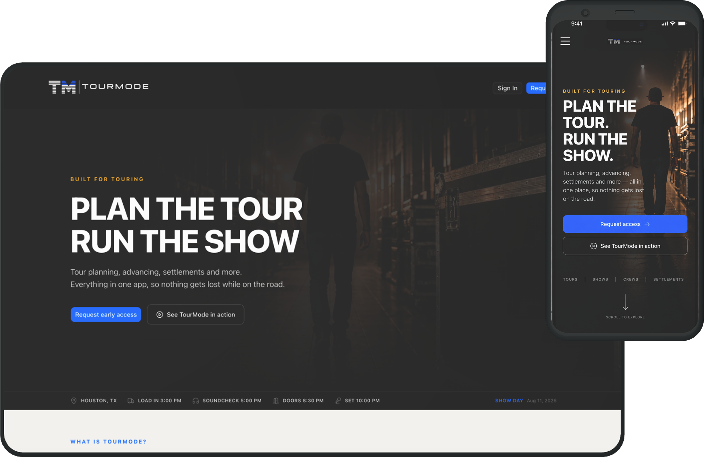
Earn a tour manager's trust instantly
Nothing lost between the spreadsheet, the group chat, and the printout taped to a dressing-room door.
TourMode pulls tour planning, advancing, day sheets, and settlements into one app. Its audience is tour managers and crews: practical people, moving fast, deciding in seconds whether a tool is worth their time.
The brief was a brand that earns their trust instantly. It had to feel built for the road, confident and no-nonsense, and a landing page that turns a skeptical scroll into a request for access.
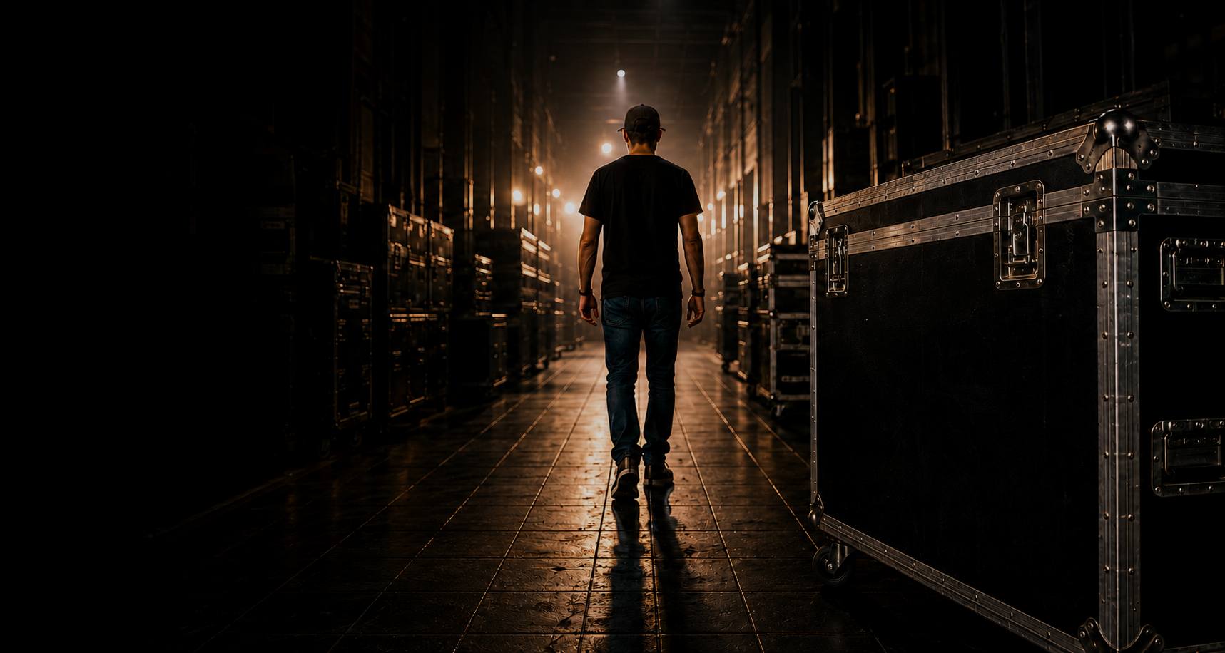
Plan the tour. Run the show.Imagery from the live site
Loud where it counts, quiet everywhere else
Built to read at a glance in a dark venue. The system is dark by default, the way a stage is. A heavy, condensed display face sets the headlines like a tour poster; an electric blue drives the actions; and a warm amber marks the touring-world details. Light, spacious sections give the product room to breathe between the loud moments.

Built for touring
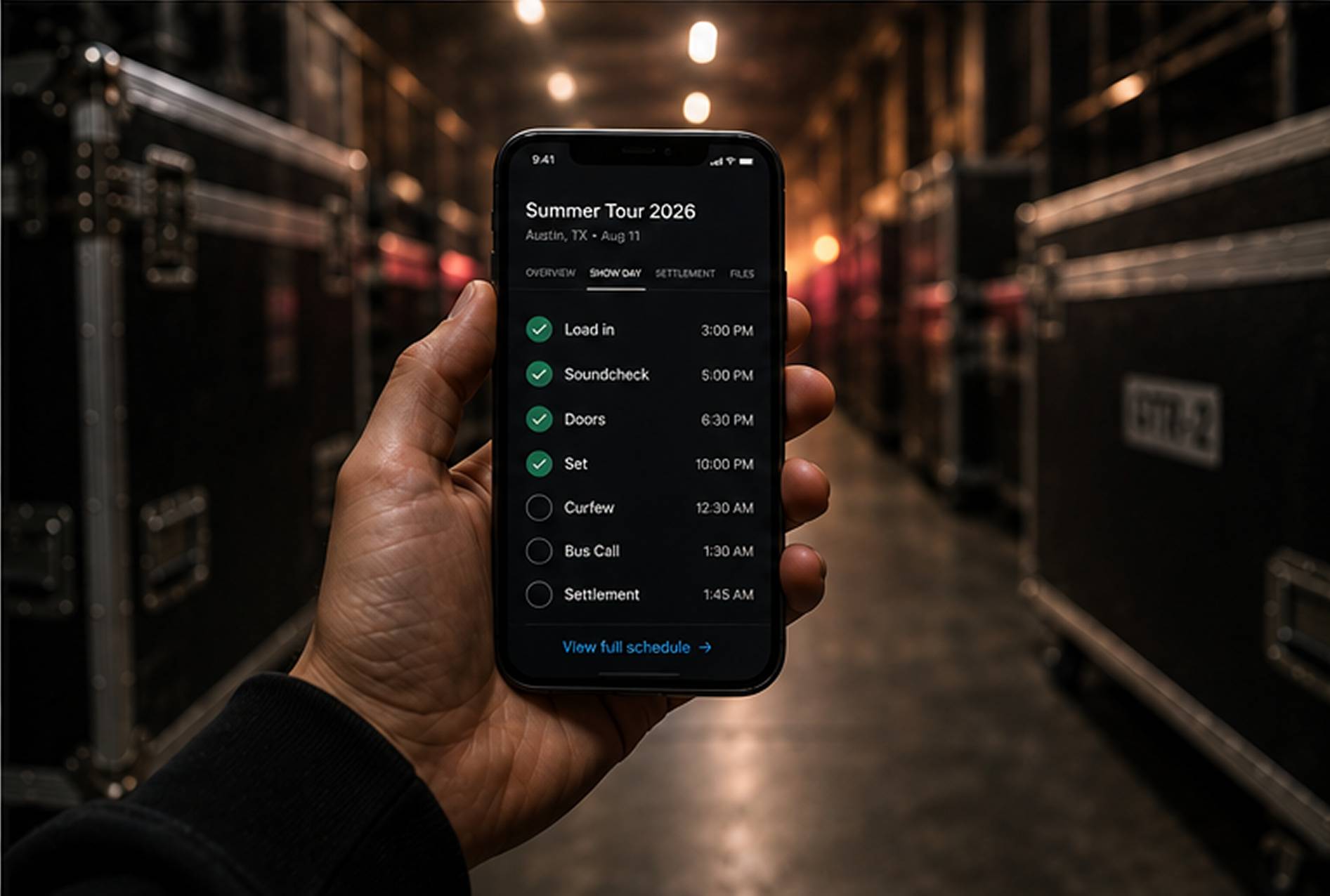
Every show, start to finish
Tour planning, advancing, day sheets, and settlements in one app.
- DisplayRun the showInter · 72
- Heading 1Every show, start to finishInter · 44
- Heading 2Advance & crewInter · 28
- BodyDay sheets and settlements, all in one place.Inter · 18
- CaptionBuilt for touringInter · 12
A cinematic open, then an honest walk-through
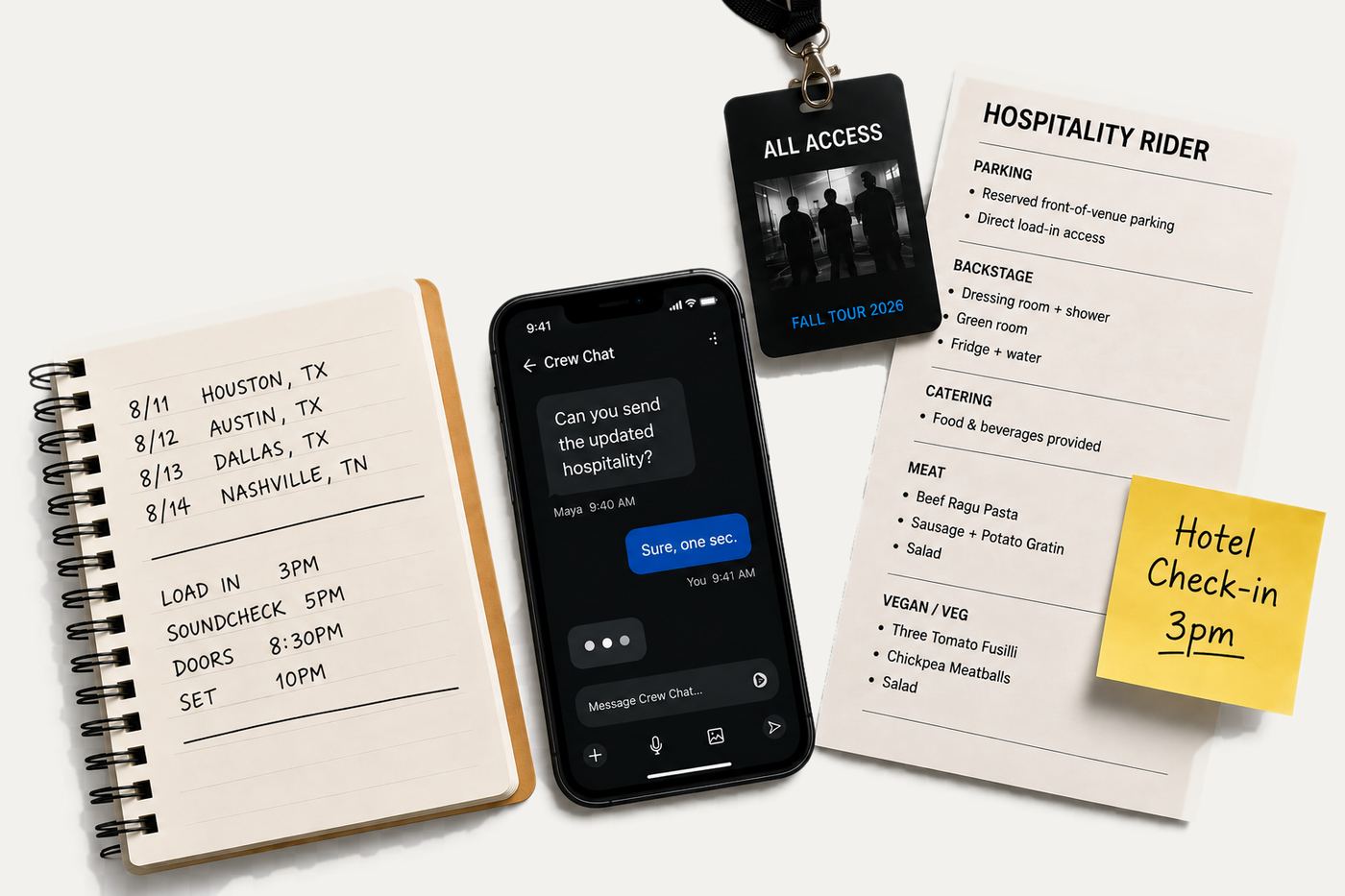
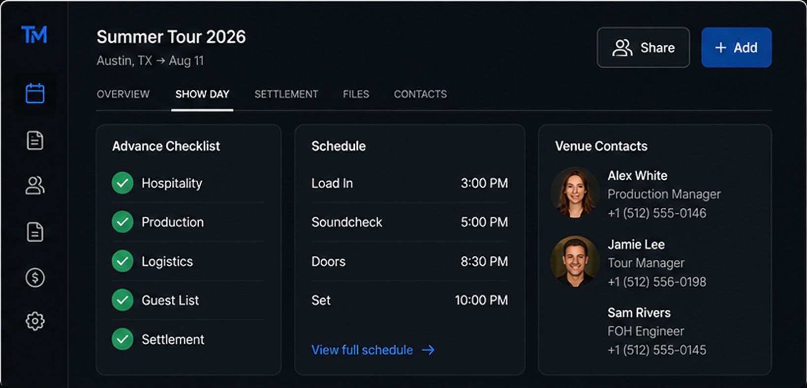
The homepage opens like a show: a black hero, the tagline set huge, and a live show-day status bar ticking through load-in, soundcheck, doors, and set. From there it gets practical. Four plain steps, Plan, Advance & Crew, Run the Show, and Settle, lay out what the app does, and a side-by-side "old way versus new way" makes the pitch without a word of hype.
Because the app is invitation-only for now, every call to action points at one thing: request early access. The whole page is built to earn that single click.
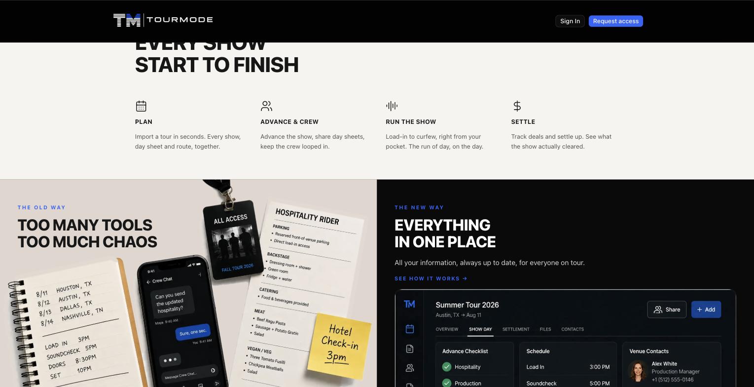
- Hero + taglineBlack stage, the tagline set huge
- What it doesPlan, advance, run, settle
- Old way vs new wayThe pitch, without hype
- Request early accessThe one click the page earns
A brand that looks like it belongs on a tour laminate, and a landing page built around a single, honest ask.
The marketing site is live and the product is rolling out in early access, in real use on the road.
Visit tourmode.app →