Music Accelerator a bold brand for an intensive music school
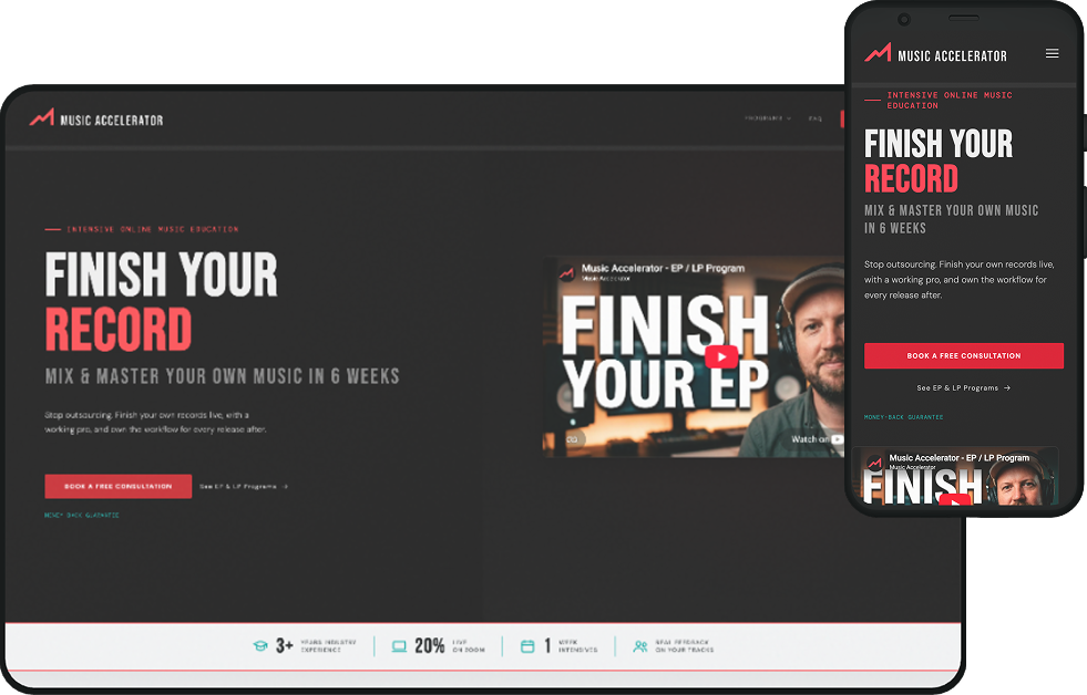
I created the visual identity and designed the marketing experience for Music Accelerator, an intensive online program that helps musicians mix and master their own records. The challenge: a brand confident and credible in the music world, and a detailed, high-commitment program that's easy to understand.
Credible in music, clear as a course
Musicians leave with a finished release and a workflow they can repeat.
Music Accelerator is an intensive online music education program built around a clear promise: musicians work on their own tracks with an experienced professional and leave with both a finished release and a repeatable workflow. The current offering includes six-week EP and LP programs delivered live online.
The program name and marketing copy came from the client. I developed the visual identity, including the logo, color and typography, and designed how that identity translated across the website.
Bold enough for music, structured enough for education
I built the visual identity around a near-black foundation, a coral primary accent and a teal secondary accent.
Tall condensed typography gives headlines and the wordmark a strong editorial character, while a simpler sans serif handles longer content and keeps detailed program information readable.
The system was intentionally designed to work across both dark and light environments, letting different sections of the site change emphasis without feeling like different brands.

Artist · Producer · Engineer

Stop outsourcing. Finish your own records.
Live, with a working pro, and own the workflow for every release after.
- DisplayFINISH YOUR RECORDBebas · 120
- Heading 1WALK AWAY WITHBebas · 64
- Heading 26-WEEK EP PROGRAMBebas · 40
- BodyWork on your own tracks with an experienced professional.DM Sans · 17
- CaptionMoney-back guaranteeDM Sans · 13
Using contrast to control pace
The website opens with a dark, high-energy visual language, then shifts between dark and light sections as the information becomes more detailed.
The lighter outcome and program areas create breathing room for content that needs more attention, while condensed headlines, numbering, cards and repeated structures maintain the character of the brand. It made a content-heavy site easier to scan without making every section look or behave the same.
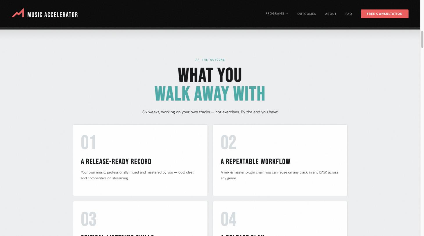

- AttentionDark, loud, one promise
- ProblemWhy records stall
- OutcomeWhat you walk away with
- ProofA working pro
- ProgramEP and LP, six weeks
- ActionBook a free consultation
A path for every level of readiness
The program is a meaningful commitment, so I didn't want every interaction to depend on someone being ready to enroll immediately.
Visitors can explore the programs, download the full curriculum, request a free consultation, or move toward joining a program. The homepage also surfaces reassurance around the live format and money-back guarantee near the program decision, so someone who is interested but still deciding has a path forward.
- BrowsingExplore the programsSee what each program covers
- CuriousDownload the curriculumTake the detail away
- ConsideringFree consultationTalk it through first
- ReadyJoin a programBacked by a money-back guarantee
Bold enough to feel connected to the music industry, structured enough to explain a detailed educational product.
The completed system gave Music Accelerator a unified identity and responsive marketing site for launch, with clear paths for visitors to explore programs, review the curriculum, speak with the instructor, or enroll.
Visit music-accelerator.com →