Mzingo Adventures is a Kenya-based safari tour company that launched shortly before the COVID-19 pandemic and remained inactive until international travel resumed in 2022. Early demand was validated through word-of-mouth referrals, including an initial individual booking and a subsequent group of 12 travelers.
However, referrals alone were not a scalable growth strategy. To attract new customers, Mzingo Adventures needed their website to function as a primary acquisition and conversion channel. They requested a UX evaluation to assess whether the site effectively communicated their offerings, addressed traveler needs, and built sufficient trust to convert first-time visitors.
While the existing website was technically functional and had strengths in branding, color usage, and general layout, it did not consistently follow UX best practices. Key issues were identified across usability, accessibility, and information hierarchy, making it difficult for users to quickly understand the offerings or take action.
I applied UX best practices to restructure the experience, improving content clarity, navigation, and accessibility. By refining information hierarchy, simplifying user flows, and optimizing the interface for clarity and ease of use, the redesigned website became more user-friendly and better aligned with the needs of prospective travelers—supporting discovery, trust, and conversion.
Before beginning the research phase, I defined a set of clear research goals and created a research plan to ensure alignment between business objectives, user needs, and design outcomes.
The primary goals of the research were to:
-Improve the overall user experience of the Mzingo Adventures website through a research-driven redesign.
-Ensure a responsive, mobile-first experience that supports users across devices.
-Understand the end-to-end booking journey, including how users research, compare, and decide on safari tours.
-Identify user goals and motivations when visiting a travel or safari website.
-Uncover usability pain points and friction commonly experienced on travel websites.
-Determine key features and content users expect and rely on when planning and booking trips.
-Explore opportunities to increase conversion, turning website visitors into qualified leads and customers.
-Align business and user perspectives by gathering foundational insights from stakeholder interviews.
These goals guided the research methodology and ensured that design decisions were grounded in both user behavior and business needs.
Before initiating the redesign, I conducted a heuristic evaluation of the existing website to assess usability and identify priority issues. This evaluation helped surface gaps related to usability, accessibility, and information hierarchy, allowing me to focus the redesign on the most impactful problem areas.
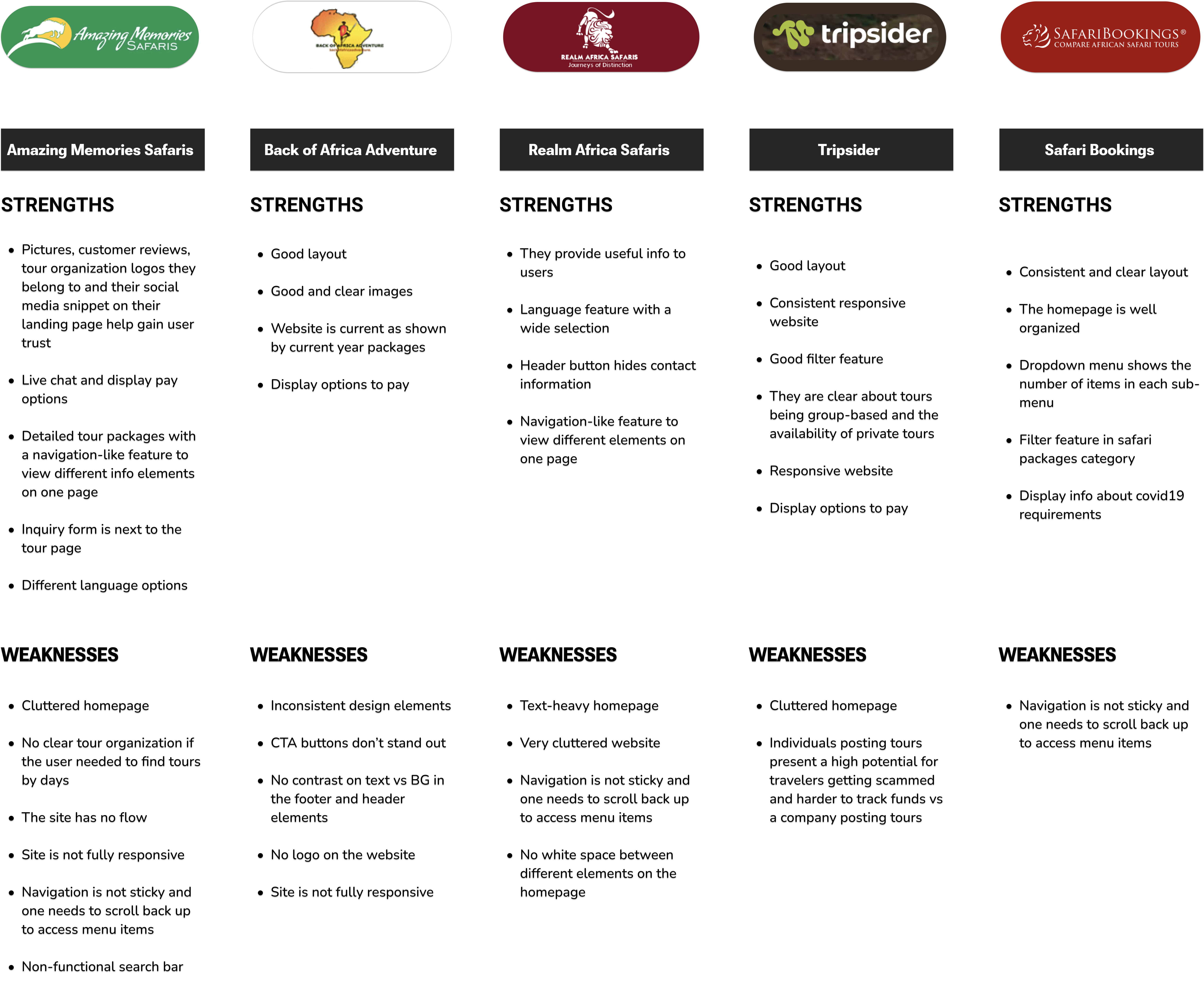
I conducted competitive and comparative analysis of similar tour and travel websites to understand current market patterns, common features, and best practices. This helped establish a baseline for industry standards and identify opportunities to differentiate the Mzingo Adventures experience.
I conducted qualitative user interviews with travelers who had previously booked leisure trips to understand their planning and booking behaviors. A total of 7 participants were interviewed, with each session lasting approximately 15 minutes.
The interviews focused on uncovering decision-making patterns, discovery channels, and trust signals users rely on when booking tours and safaris.
Sample interview questions included:
After the interview, I did affinity mapping so I could identify patters and themes from the data I got after user research.
Through the patterns I identified, I was able to make 2 personas who I named Sally and James.
To maintain a strong user-centered focus throughout the design process, I defined a clear Point of View (POV) and translated key research insights into actionable How Might We (HMW) questions. These statements helped frame opportunity areas and guided ideation and feature prioritization.
Key HMW statements included:
To deepen empathy for Sally and James, I created detailed user flows to map their end-to-end journeys when interacting with the website. This exercise focused on understanding their goals, decision points, and mental models as they attempted to complete key tasks across different scenarios.
By visualizing these flows, I was able to step into the users’ perspective and evaluate the full experience—from initial discovery to decision-making and conversion. Mapping these journeys helped surface friction points, potential drop-offs, and unmet needs, as well as opportunities to streamline interactions.
These insights directly informed design decisions around navigation, content hierarchy, and task flows, ensuring the final experience supports a more intuitive, seamless journey aligned with user expectations.
o understand how users would interact with the Mzingo Adventures website, I first identified the core tasks that Sally and James needed to complete in order to achieve their goals. These tasks were defined by referencing the UI requirements document, which outlined key pages, features, and functional expectations across the experience.
Using this foundation, I created task flows to map the step-by-step interactions required to complete each task. These flows helped visualize how users would navigate the site, where decisions would occur, and how information would be consumed at each stage.
By analyzing these task flows, I was able to identify opportunities to reduce friction, simplify decision-making, and optimize navigation paths, ensuring the experience supported efficient task completion and aligned with user expectations. These insights directly informed layout decisions, content prioritization, and interaction design throughout the redesign.
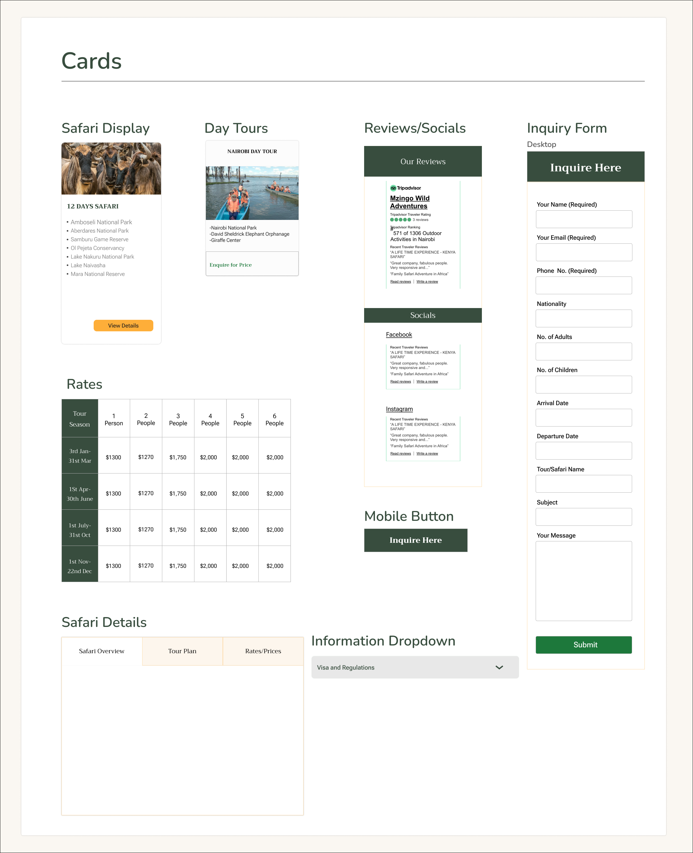
Drawing on insights gathered throughout earlier research phases, I made intentional, data-informed decisions about the organization and hierarchy of content on the Mzingo Adventures website. These decisions were guided by project goals and focused on aligning content structure with both user needs and business objectives.
Leveraging findings from user research, prioritization exercises, user flows, and task analysis, I defined the most effective way to structure and present content across key pages. This process ensured that critical information was surfaced at the right moments, reducing cognitive load and supporting clearer decision-making throughout the user journey.
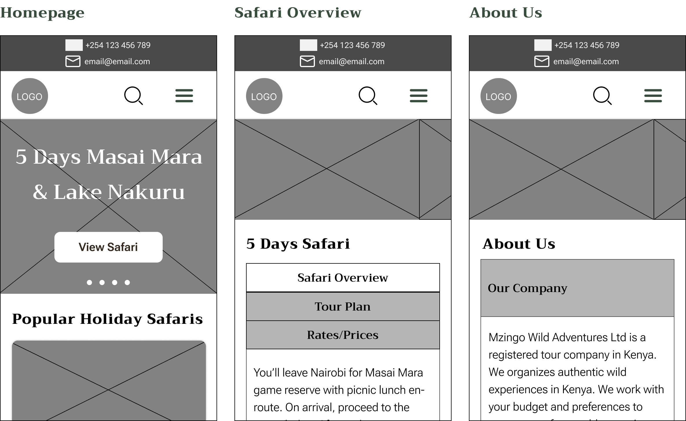
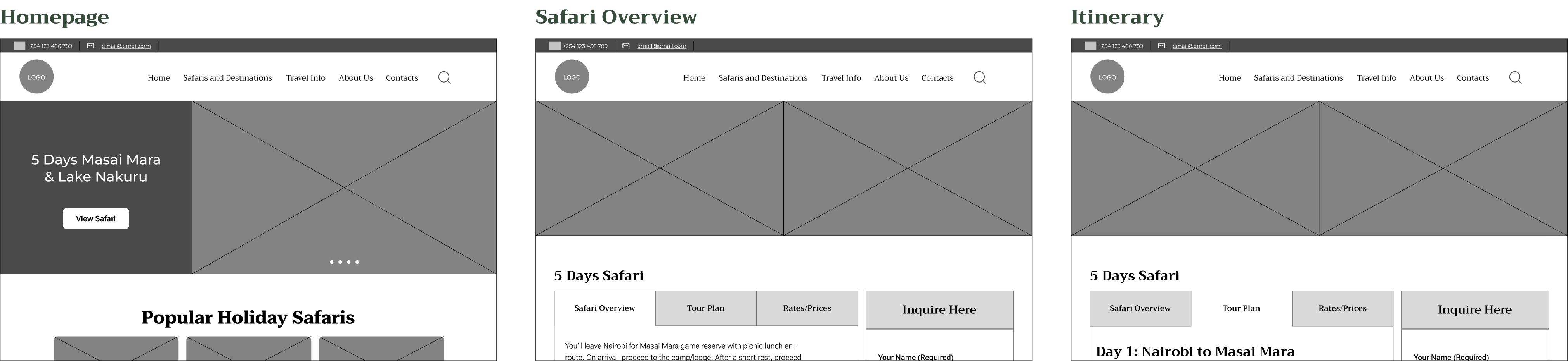
Once the website’s overall structure was finalized in the mid-fidelity wireframes, I conducted usability testing with six participants from the original interview group to validate the proposed information architecture and user flows.
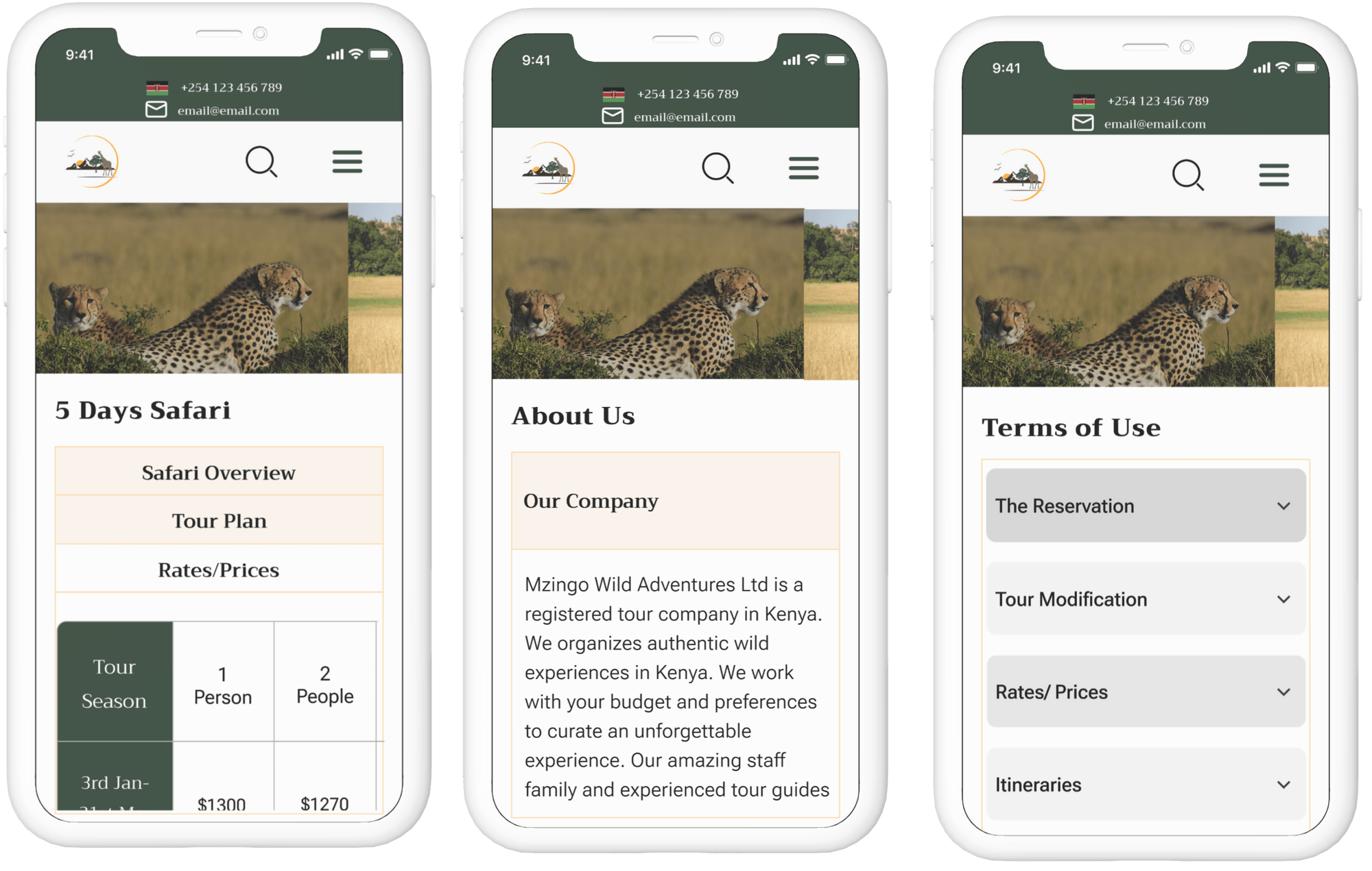
While awaiting feedback, I documented a style tile and core UI components to support visual consistency and scalability. However, during stakeholder review, Mzingo Adventures expressed a preference to retain their existing corporate identity and postpone visual branding changes at this stage.
As a result, the project focused on structural and experiential improvements rather than visual rebranding—ensuring usability, clarity, and conversion improvements without disrupting the brand’s established look and feel.
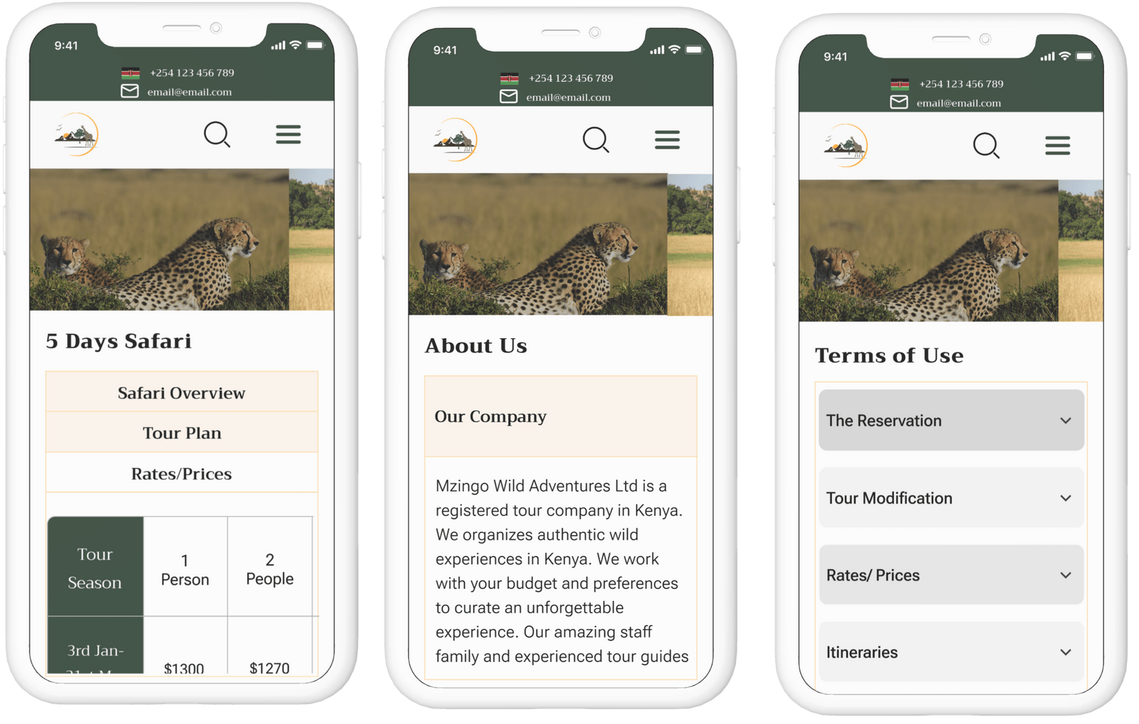
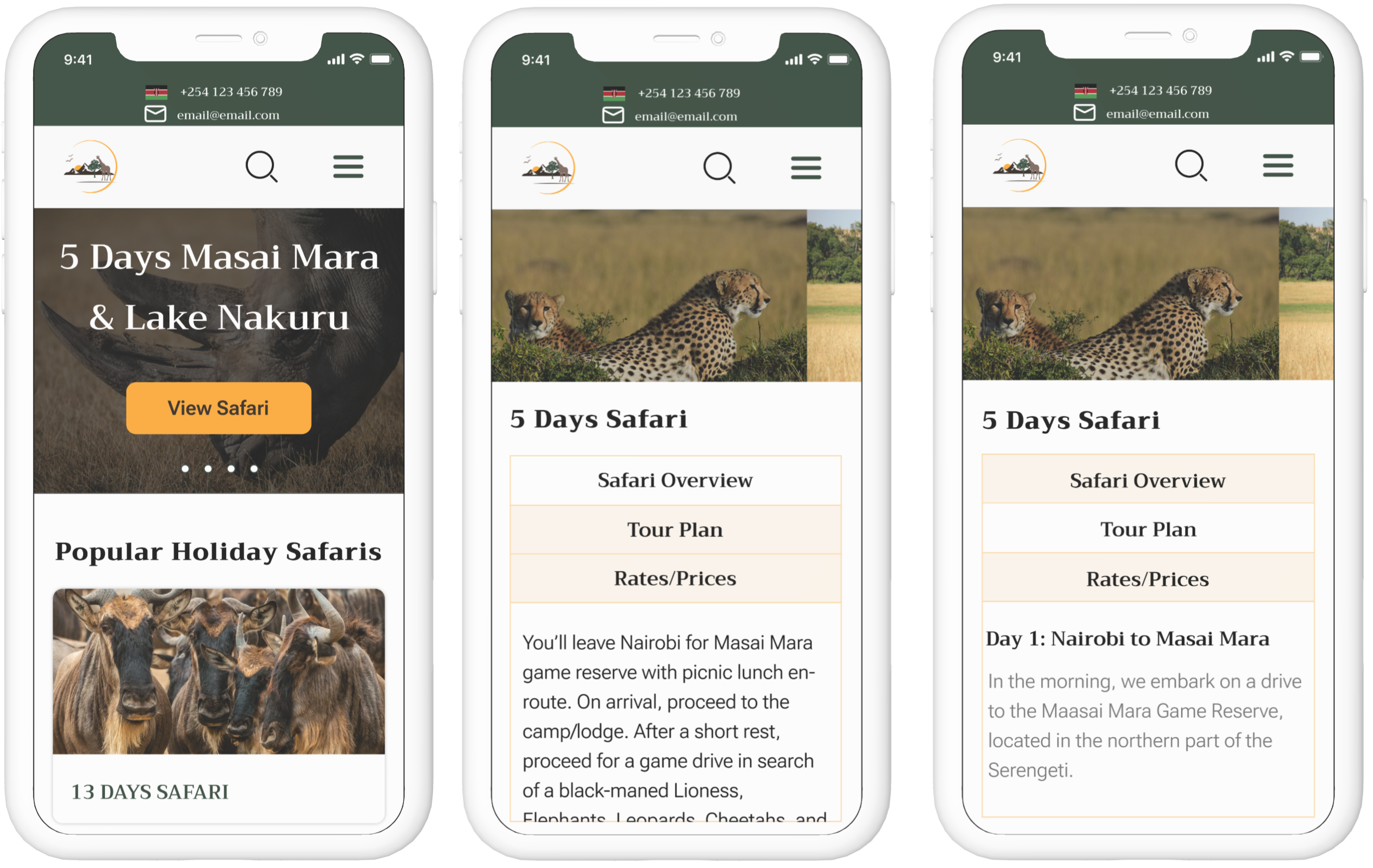
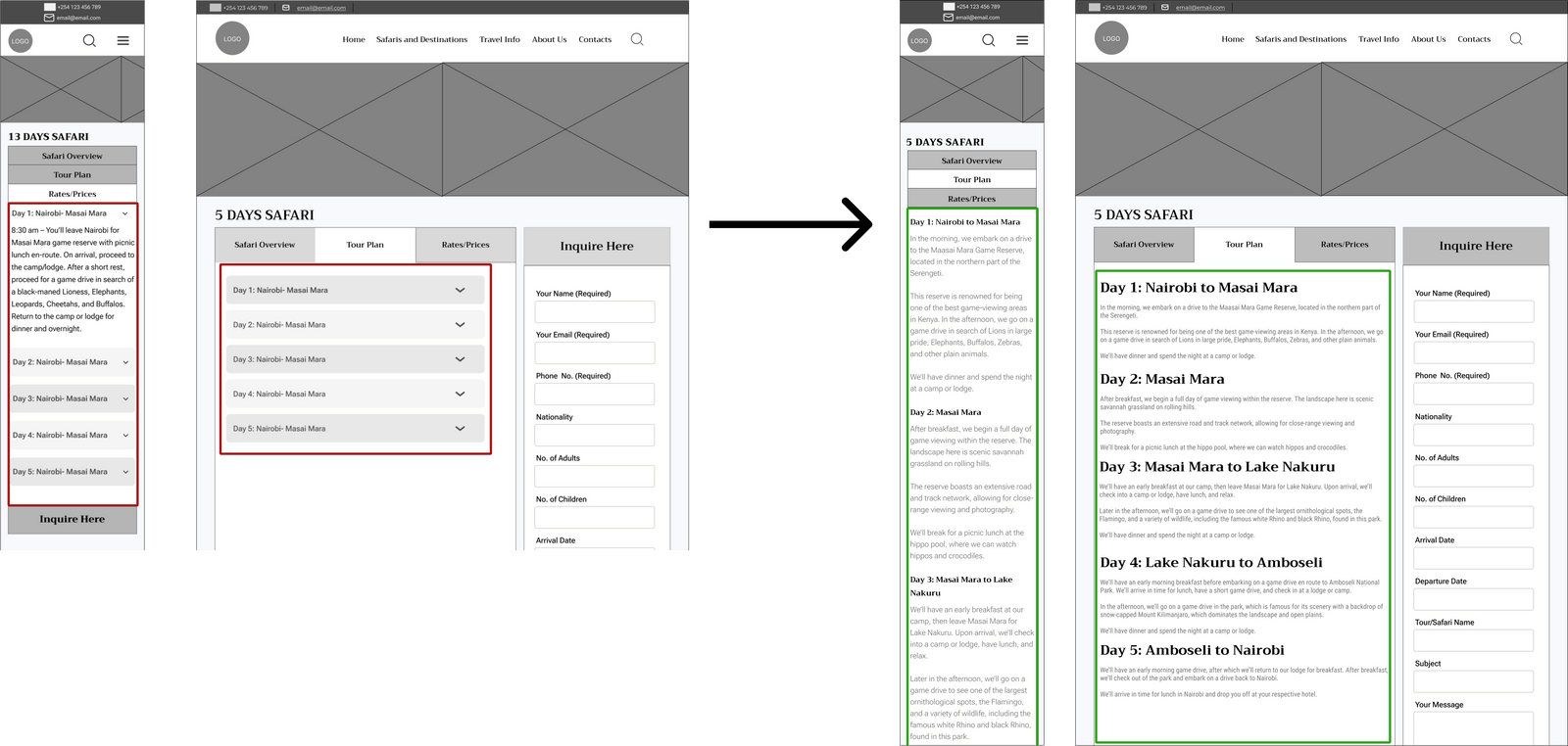
I conducted remote usability testing with 5 participants using Loom to evaluate the mid-fidelity designs. A key usability issue emerged: users found it tedious to open multiple accordions in order to access critical information. This interaction pattern slowed information retrieval and increased cognitive effort.
This friction indicated that the accordion-based layout was negatively impacting scanability, task efficiency, and overall user satisfaction, particularly for users attempting to quickly compare options or gather key details.
Based on these findings, I redesigned the interaction by removing the accordion pattern and surfacing essential information more directly. This change reduced interaction cost, improved content visibility, and enabled users to access information more quickly and efficiently, resulting in a smoother and more intuitive experience.
Iteration 2
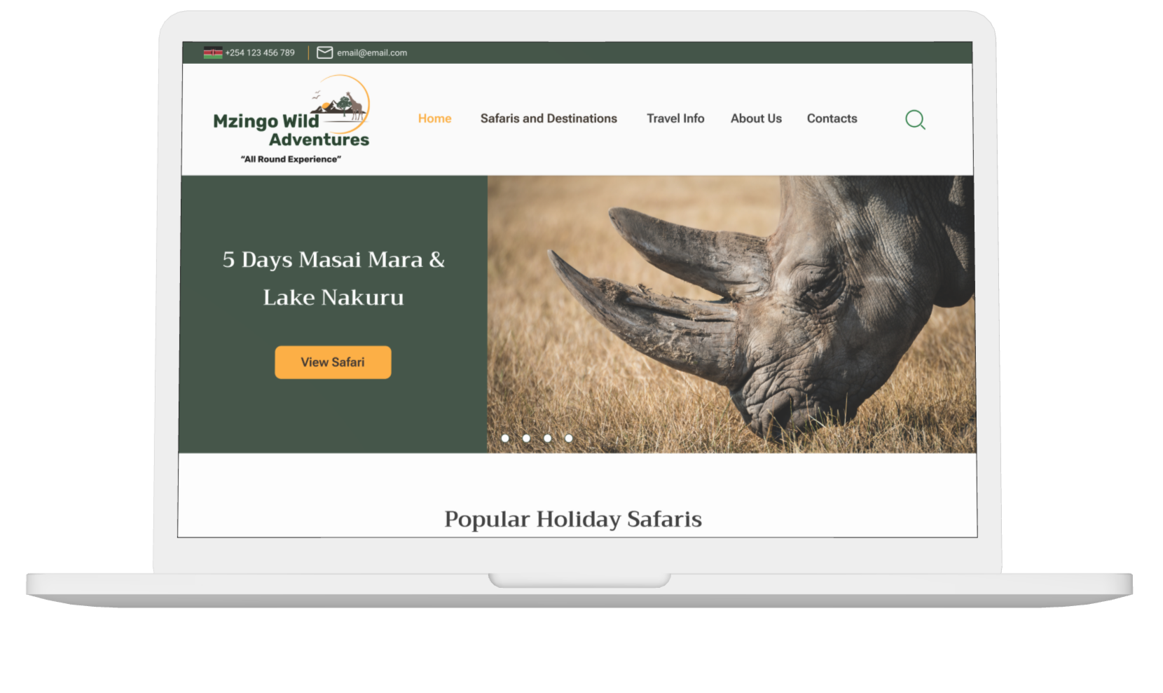
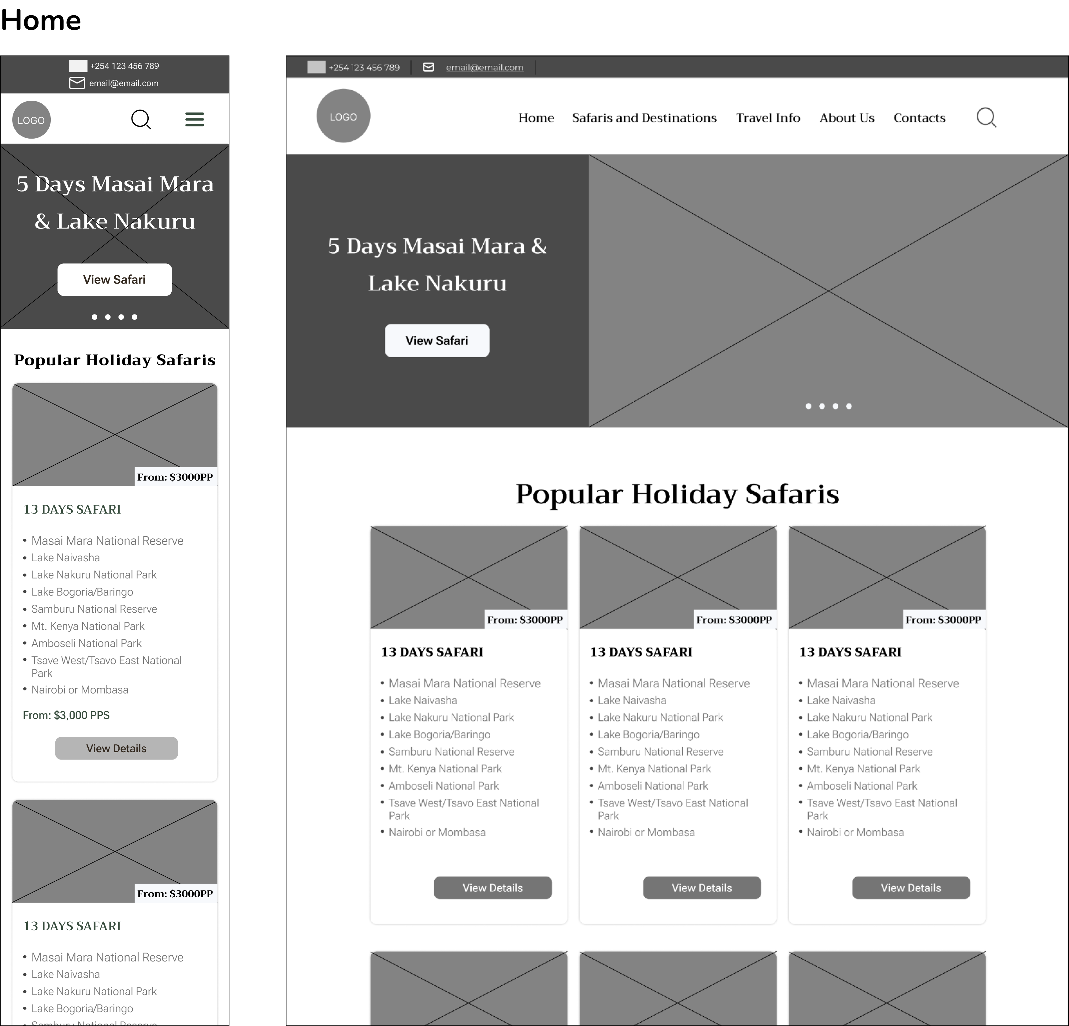
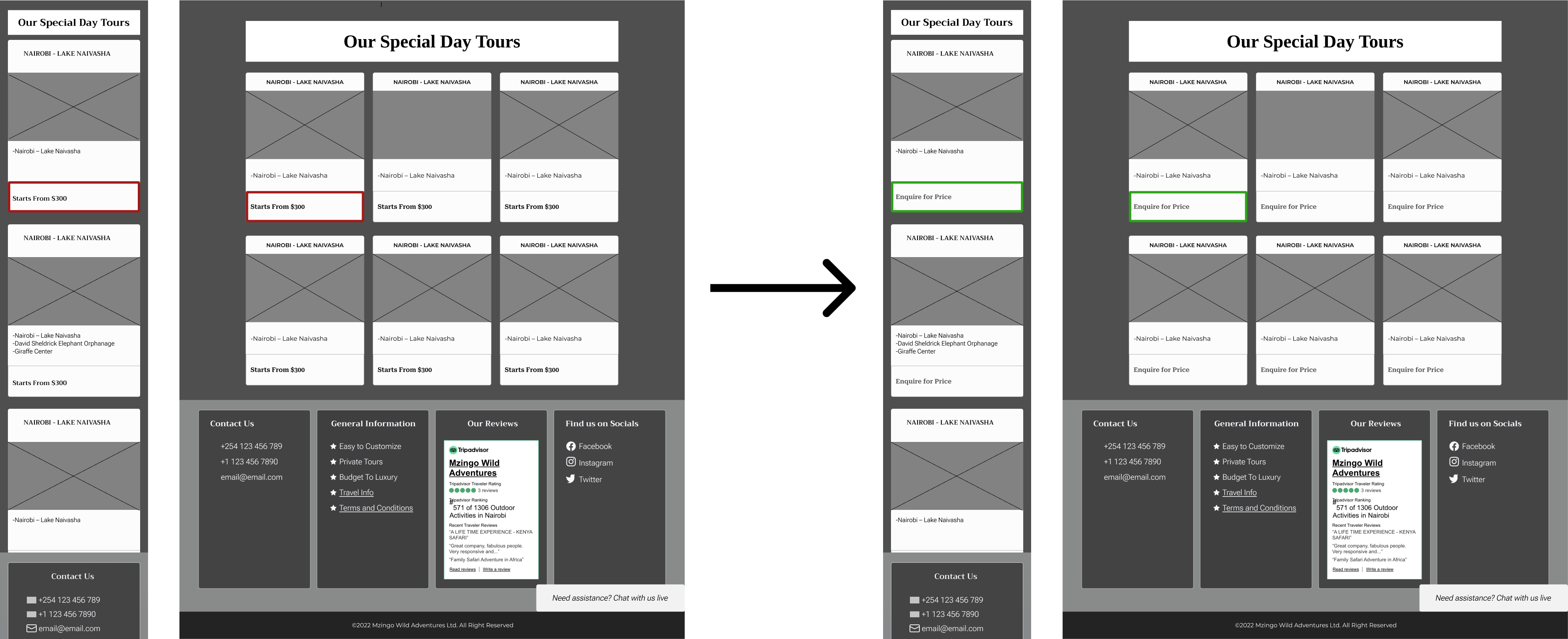
Another insight from usability testing revealed that displaying the estimated safari price prominently at the front of the image disrupted the natural information flow. Users tended to anchor on price before understanding what the safari experience included, which risked overshadowing important contextual details such as activities, itinerary highlights, and value.
To support better decision-making, I adjusted the content hierarchy so users first engage with the experience and offerings, followed by pricing information. This sequencing helps users build context and value before evaluating cost, enabling more informed and meaningful comparisons rather than decisions driven solely by price as a first impression.
This iteration improved narrative flow, strengthened perceived value, and aligned the experience with user decision-making behavior observed during testing.
Iteration 3
During stakeholder review, Mzingo Adventures provided critical business context regarding pricing. They noted that safari costs vary significantly based on seasonality, availability, and group size, making fixed or starting prices potentially misleading.
Based on this input, I updated the experience to display pricing as “Price on Enquiry” rather than a fixed estimate. This change ensures accuracy, sets appropriate expectations, and encourages direct engagement with the business, while still allowing users to evaluate tours based on experience, activities, and suitability before discussing cost.
This iteration balanced user clarity with operational reality, aligning the design with real-world business constraints and reducing the risk of misinterpretation.
After implementing the iterations, I conducted follow-up usability testing with 3 participants using Loom to validate the changes. The results confirmed that the updates were effective—users were able to complete their tasks more easily, access information more quickly, and navigate the experience with less friction.
This validation step demonstrated that the design changes successfully improved usability and better supported users in accomplishing their goals.